
 By
By
It has become very easy to create fluid application layouts thanks to the CSS3 Flexible Box Layout Module. In this article we are going to implement a simple application layout, which fills the whole screen, resizes with the browser window and comes with the additional bonus of a draggable splitter.
Instead of the classic <div> elements let’s also use some HTML5 structural tags. This will not only make the code more semantic, but also more convenient to work with, since we can directly address the elements with a CSS type selector without having to rely on id attributes or parent-child relationships.
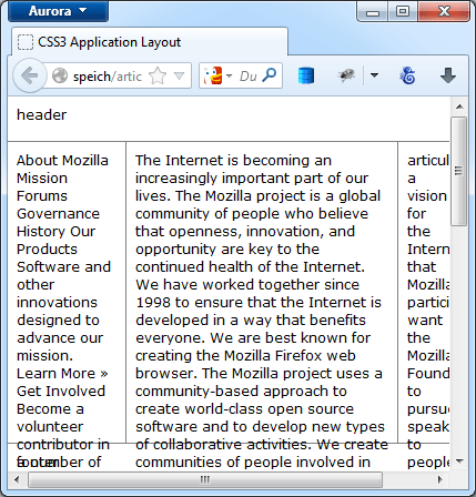
Take a look at the complete demo to see how it works.
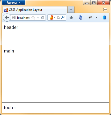
First step: Add Vertical Boxes
We start with only three tags (<header>, <main> and <footer>) in the body.
CSS3 Application Layout
Let’s add the CSS to make these three elements fill the space vertically. This is achieved by setting the CSS display property of the <body> to flex and the flex-direction property to column. This tells the browser to lay out the body’s children (<header>, <main> and <footer>) as vertical flexible boxes.
How this available space is distributed can be controlled with the flex shorthand property. You can read about it on MDN. In this application layout though, we don’t want the size to shrink or expand proportionally. Instead the <header> and the <footer> element should have a fixed height, whereas the <main> should just fill the remaining space by setting its flex property to auto.
html, body {
    height: 100%;
    width: 100%;
    padding: 0;
    margin: 0;
}

body {
    display: flex;
    flex-direction: column;
}

header {
    height: 75px;
}

main {
    flex: auto;
}

footer {
    height: 25px;
}
Second Step: Horizontal Boxes
Let’s add three more elements (<nav>, <article> and <aside>) inside the <main> element. But this time we want them to fill the space inside the <main> element horizontally instead of vertically.
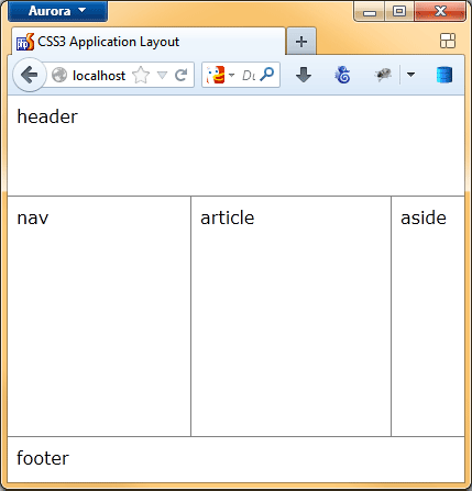
This is achieved by setting the display property of the <main> element also to flex, but the flex-direction property to row (this is the default). The <nav> and <aside> element should have a fixed width, while the <article> should just fill the remaining space: this is achieved in the same kind of manner as before:
main {
    display: flex;
    flex-direction: row;
    flex: auto;
}

nav {
    width: 150px;
}

article {
    flex: auto;
}

aside {
    width: 50px;
}
Thats all. Resize your browser window and enjoy the flexible application layout.
Next step: CSS Refinements
But wait. When there is a lot of content, an element can become smaller than specified and also scrollbars can appear.
Therefore, we need to add a min-width property to all elements where we added a width property. We also should set the overflow property of the <body> and the <main> element to hidden as well as the overflow-y of <article> and <aside> to auto to only show scrollbars where we want them.
body {
	overflow: hidden;
	display: flex;
	flex-direction: column;
}

header {
	height: 75px;
	min-height: 75px;
}

footer {
	height: 25px;
	min-height: 25px;
}

main {
	display: flex;
	flex-direction: row;
	flex: auto;
	border: solid grey;
	border-width: 1px 0;
	overflow: hidden;
}

nav {
	width: 150px;
	min-width: 150px;
}

article {
	border: solid grey;
	border-width: 0 0 0 1px;
	flex: auto;
	overflow-x: hidden;
	overflow-y: auto;
}

aside {
	width: 50px;
	min-width: 50px;
	overflow-x: hidden;
	overflow-y: auto;
}
Note: This does probably not work in Safari yet. You might be able to get it to work by using the -webkit- prefix.
Final Step: Throw a little JavaScript into the Mix
As the final step, we want the user to be able to resize the <aside> element when dragging it with the mouse. For that we add a <div> element as a splitter, which will serve as the drag handle.
We set the width of the handle to 4px and give the cursor attribute a value of col-resize, to show the user that this element can be resized East-West.
.splitter {
    border-left: 1px solid grey;
    width: 4px;
    min-width: 4px;
    cursor: col-resize;
}
All what’s left now is to add a little JavaScript, that enables moving the splitter.
var w = window, d = document, splitter;

splitter = {
    lastX: 0,
    leftEl: null,
    rightEl: null,

    init: function(handler, leftEl, rightEl) {
        var self = this;

        this.leftEl = leftEl;
        this.rightEl = rightEl;

        handler.addEventListener('mousedown', function(evt) {
            evt.preventDefault();    /* prevent text selection */

            self.lastX = evt.clientX;

            w.addEventListener('mousemove', self.drag);
            w.addEventListener('mouseup', self.endDrag);
        });
    },

    drag: function(evt) {
        var wL, wR, wDiff = evt.clientX - splitter.lastX;

        wL = d.defaultView.getComputedStyle(splitter.leftEl, '').getPropertyValue('width');
        wR = d.defaultView.getComputedStyle(splitter.rightEl, '').getPropertyValue('width');
        wL = parseInt(wL, 10) + wDiff;
        wR = parseInt(wR, 10) - wDiff;
        splitter.leftEl.style.width = wL + 'px';
        splitter.rightEl.style.width = wR + 'px';

        splitter.lastX = evt.clientX;
    },

    endDrag: function() {
        w.removeEventListener('mousemove', splitter.drag);
        w.removeEventListener('mouseup', splitter.endDrag);
    }
};

splitter.init(d.getElementsByClassName('splitter')[0], d.getElementsByTagName('article')[0], d.getElementsByTagName('aside')[0]);
Note: For some reason the resizing doesn’t work in IE11 (, Safari?) or Chrome 31. It seems that it has something to do with the display: flex; property value.
About Simon Speich
Simon Speich is a web developer, believer in web standards and a lover of Mozilla since Mozilla 0.8 He is also passionate about photography. You can find out more about him on his website www.speich.net.
More articles by Simon Speich…
About Robert Nyman [Editor emeritus]
Technical Evangelist & Editor of Mozilla Hacks. Gives talks & blogs about HTML5, JavaScript & the Open Web. Robert is a strong believer in HTML5 and the Open Web and has been working since 1999 with Front End development for the web - in Sweden and in New York City. He regularly also blogs at http://robertnyman.com and loves to travel and meet people.
6 comments