

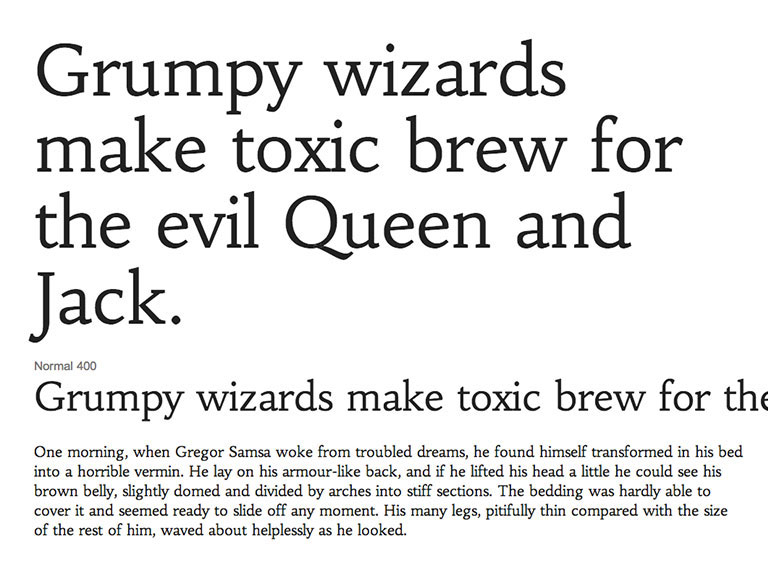
 Conventional wisdom states that body text benefits most from being set in a serif font because the serifs create a path for the eye to follow along a line and down to the next.
Despite that, many web designers have for a number of years, argued for the use of sans-serifs; and with good reason: the addition of serifs to a letterform on a screen quite literally blurs the word shapes, reducing contrast and readability.
Numerous studies have been conducted on the matter and the conclusion that most arrive at is that readers prefer whichever style of type they are most familiar with. Consequently, it would seem that either option is fine, provided it is familiar to your visitors.
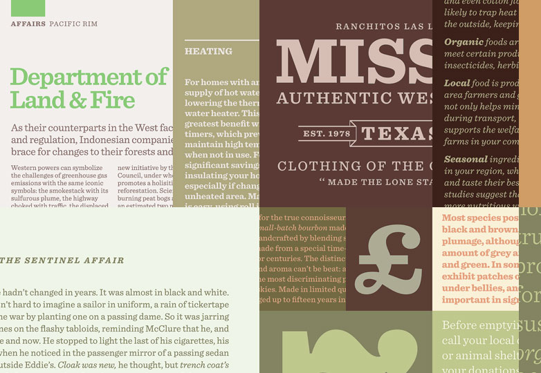
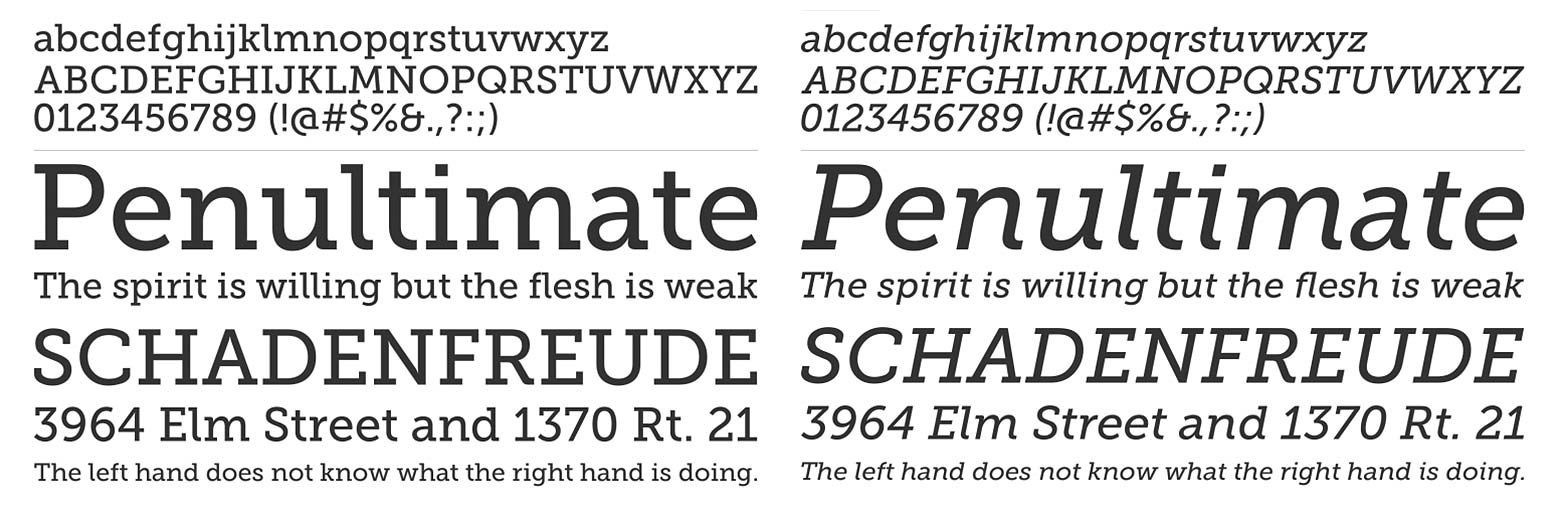
However, there is a style of type that produces the strong horizontal bars of text that serifs excel at, whilst still enjoying the high contrast of sans-serifs: the Egyptian, or slab-serif.
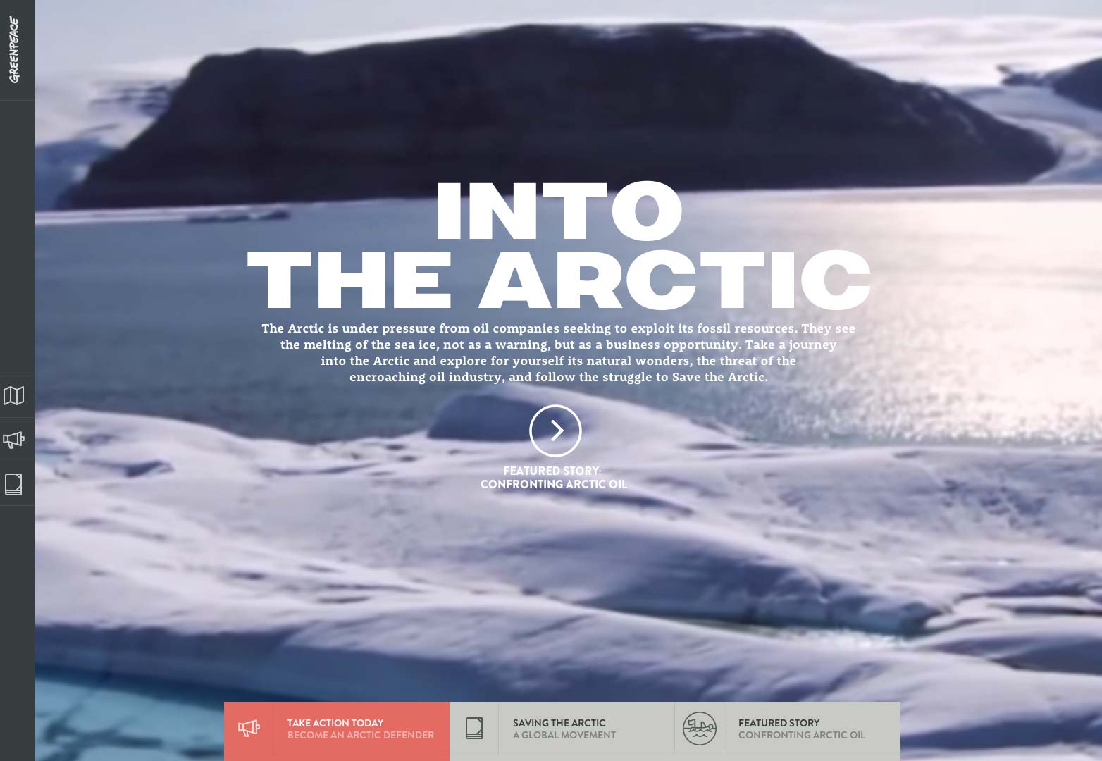
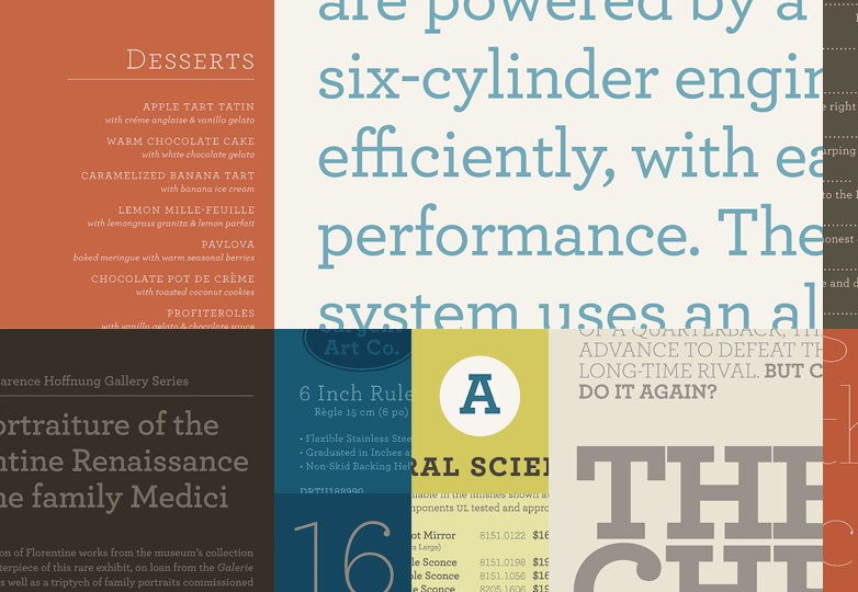
Greenpeace uses the solidity of Rooney to display white-on-white text.
Why now?
To understand why slab-serifs are perfect for the web in 2013, you need to understand where this style of type came from.
Slab-serifs (originally called Egyptians) first became popular in the wake of Napolean's Egyptian campaign (1801) and coincided with the beginning of the industrial revolution. More specifically they evolved in line with Koenig & Bauer's updated printing press that revised Gutenberg's centuries-old design; purchased by The Times in London, the new printing press made newspapers accessible to the mass population for the first time.
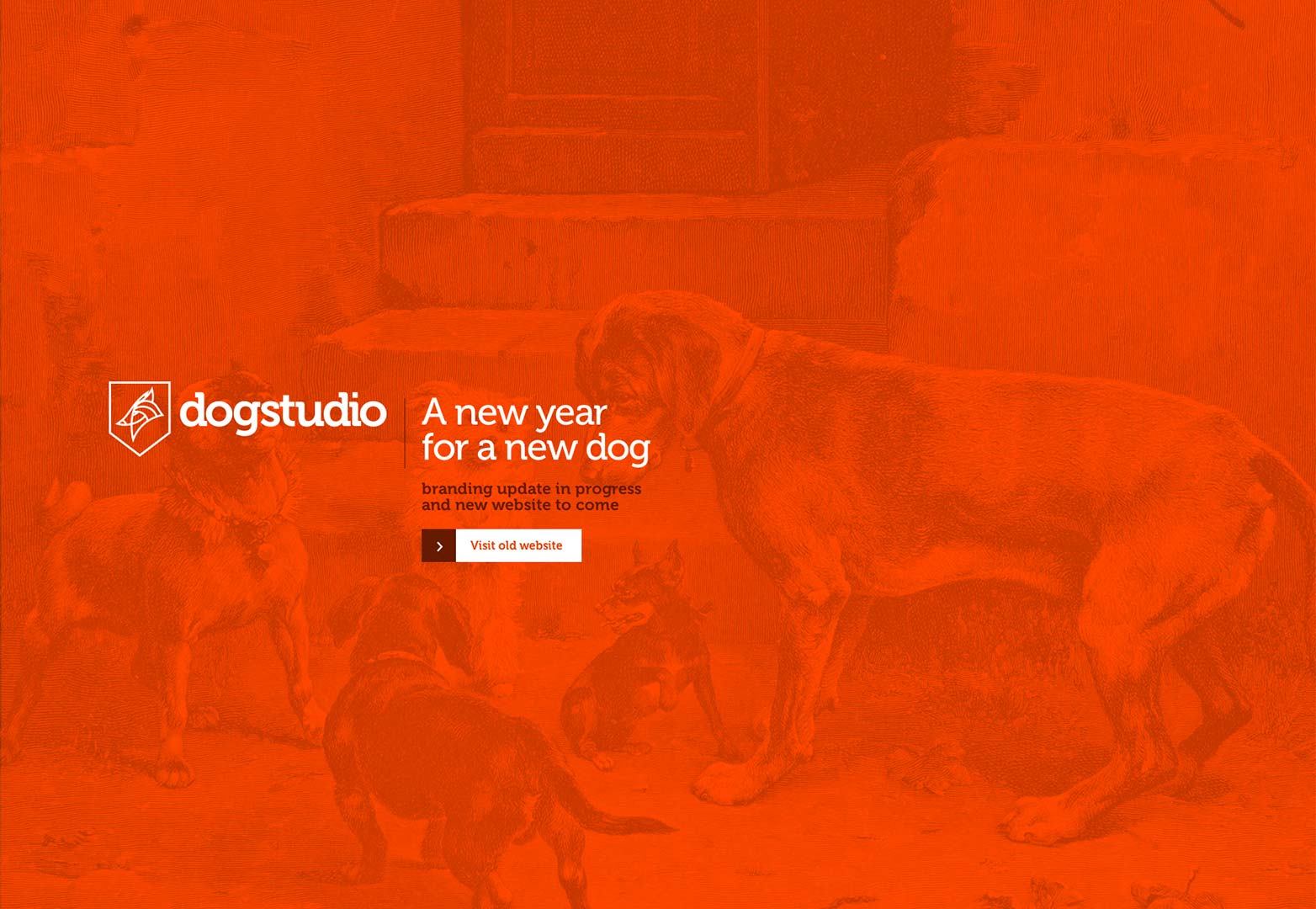
Belgium design aficionados dogstudio are embarking on a redesign of their corporate branding. The thing they're keeping? Museo.
Almost exactly 100 years later, slab-serifs experienced somewhat of a renaissance, as discoveries such as the unearthing of Tutankhamun's tomb in 1922, coincided with the explosion of advertising between the wars. The fashion for Egypt, and the solid characteristics of slab-serifs ingrained the style in the public consciousness.
In both cases, the fashion for slab-serifs was only able to grow because the letter forms function so well on cheap paper, and under low-quality printing conditions.
The same characteristics that make slab-serifs so robust, and ideal for low-quality print work, also make them ideal for the web.
Slab-serifs online
In a world of retina displays, we often forget that the web is still very much a place of pixels. Whilst some devices are certainly capable of outputting beautifully rendered pages, any web designer worth their salt will be aware of the commonality for poorer quality displays.
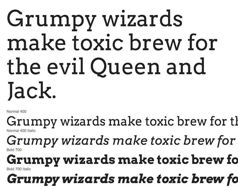
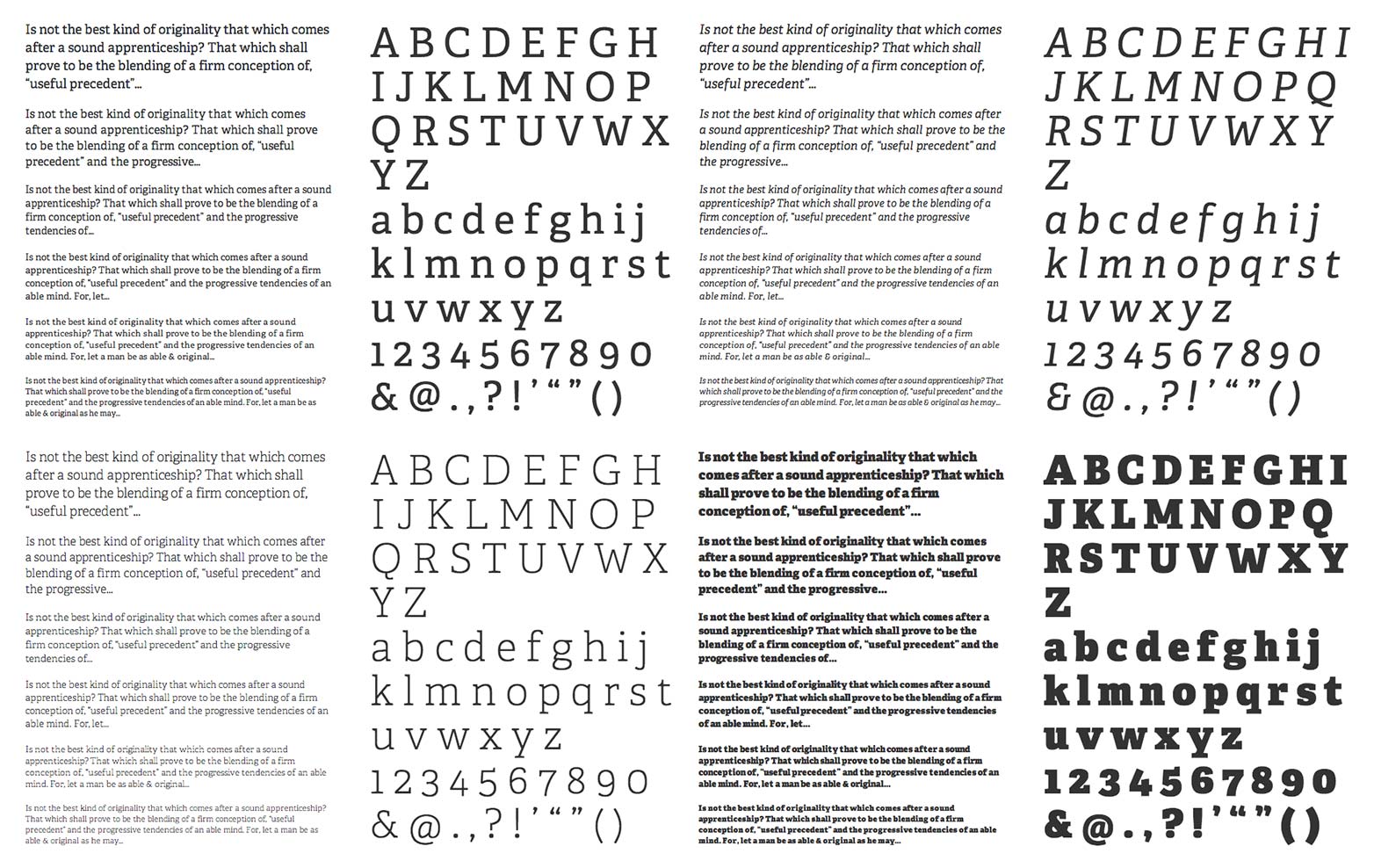
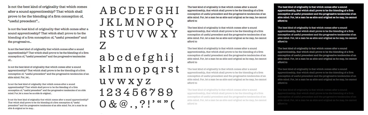
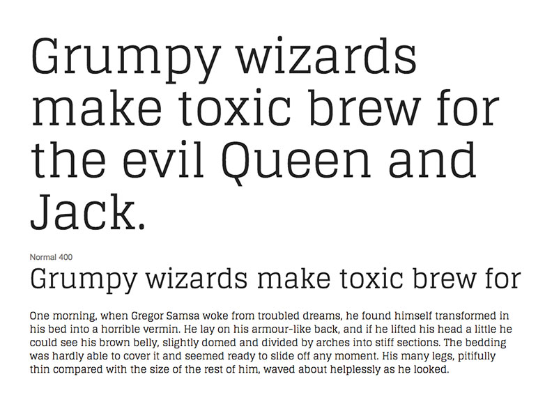
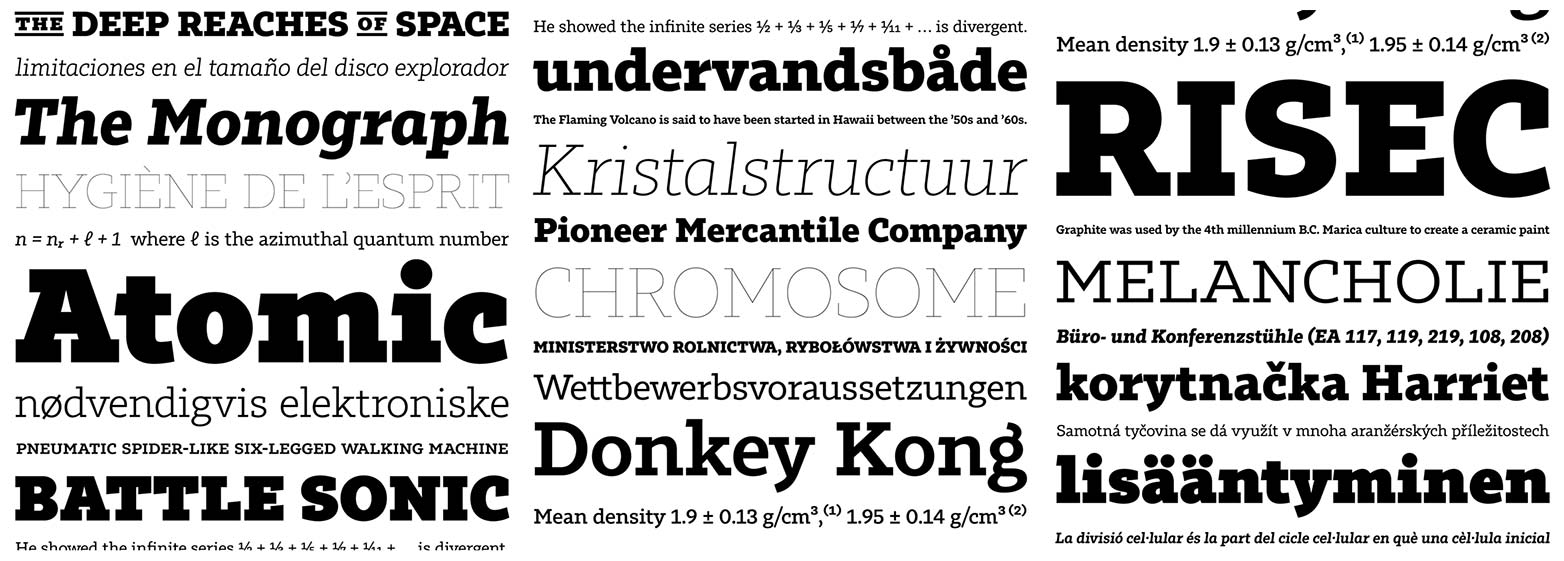
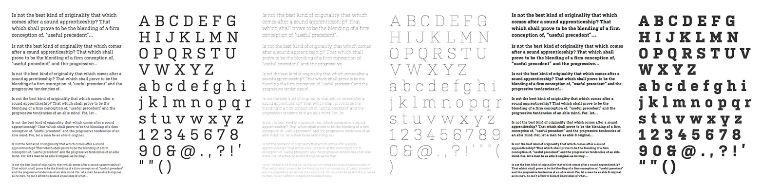
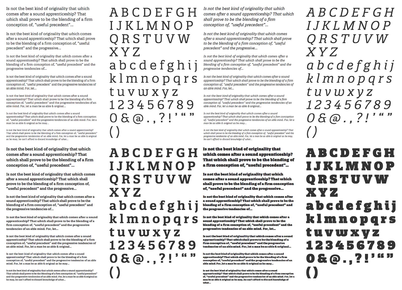
Slab-serifs are a high-contrast, horizontally biased style of type that are not only highly legible, they also produce well-defined lines of text, reinforcing the baseline grid.
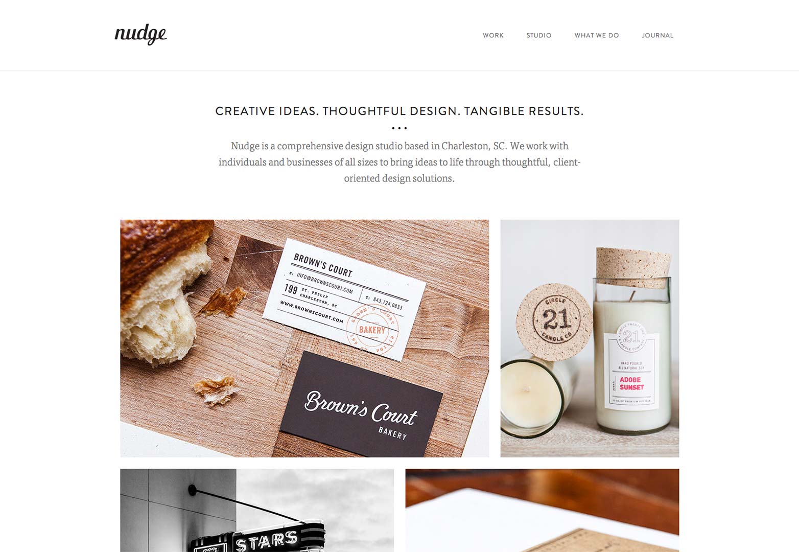
Nudge's site has a strong rhythm curtesy of FF Tisa.
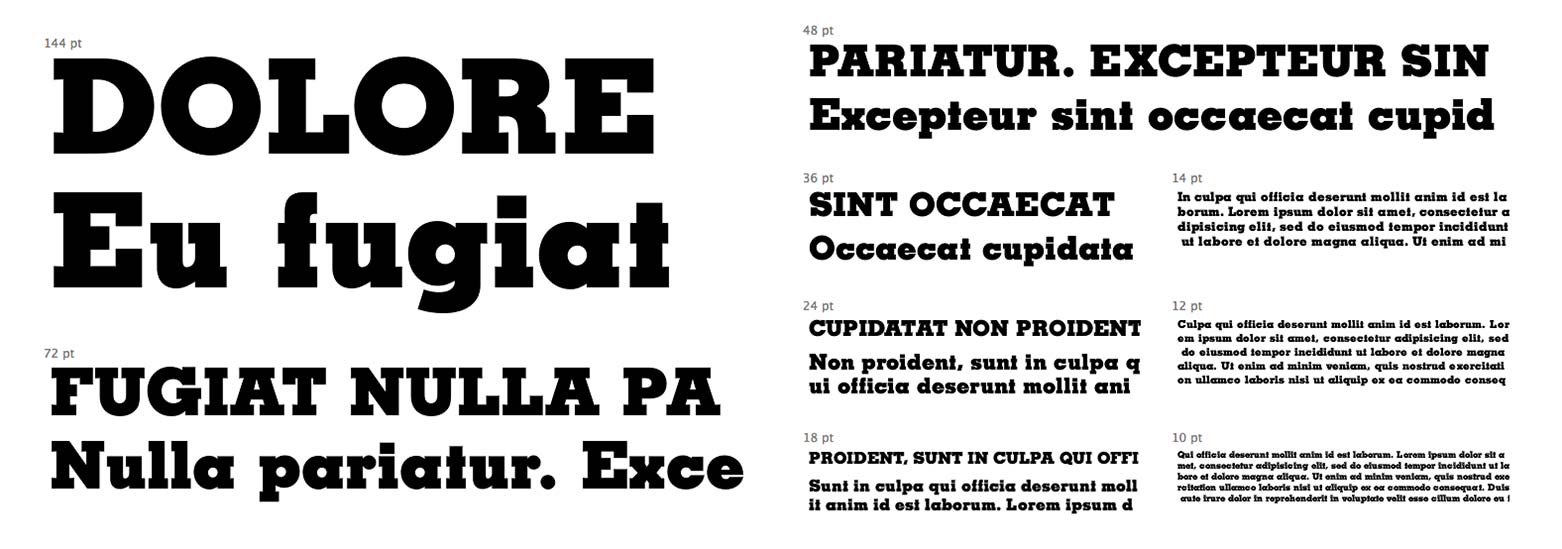
Many fonts we choose for the web were designed for print and take into account ink spread; with no ink spread on the web, fonts become too light and lose much of their detail. Slab-serifs, by comparison, tend to be far heavier and consequently retain much of their character when rendered in pixels.
The biggest benefit of slab serifs is the high-contrast between the type and page, produced by the minimal contrast between the stroke and serifs, and (usually) the lack of brackets.
The best slab-serifs
Slab-serifs seem to experience a revival every hundred years or so. Given the current rate of technological change, slab-serifs look like being popular for another decade, before they grow tired and hibernate for another century. They are this generation's typeface of choice, and to help you embrace them, we've put together a list of the very best currently available:
Sable ($35)
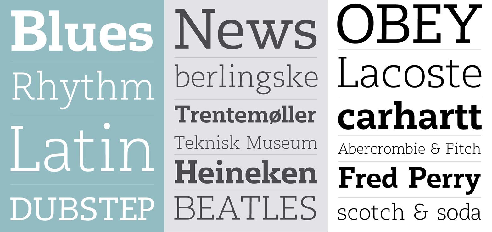
Arvo (free)
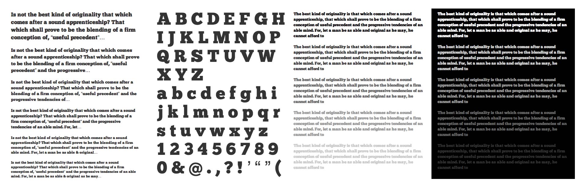
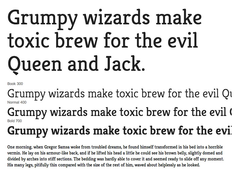
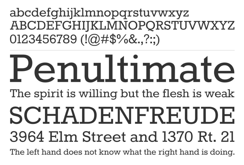
Sentinel (from $99/year)
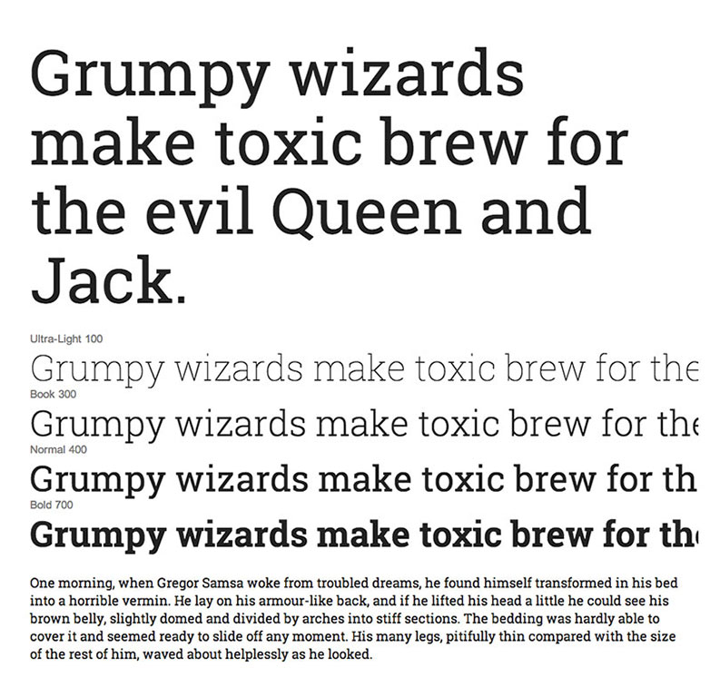
Adelle Web (free)
Abril (From $24.99/year)
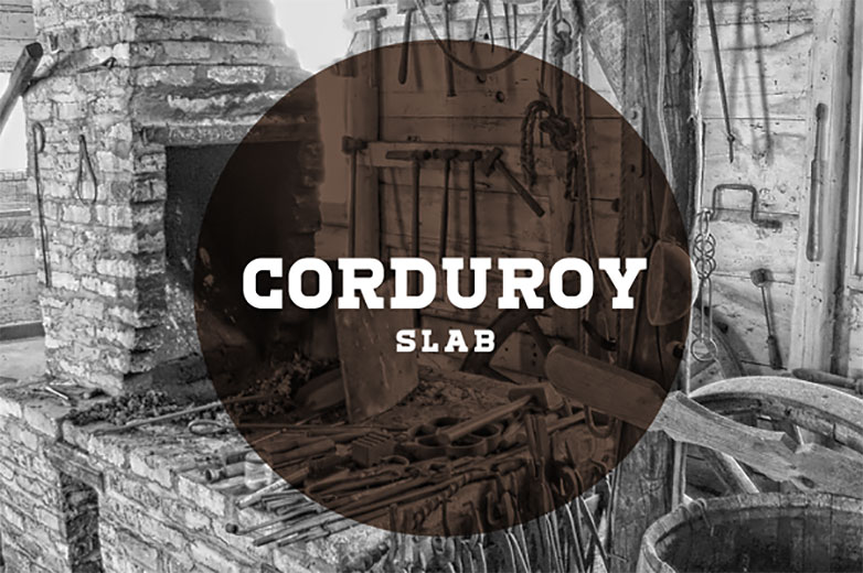
Corduroy (free)
Crete Round (free)
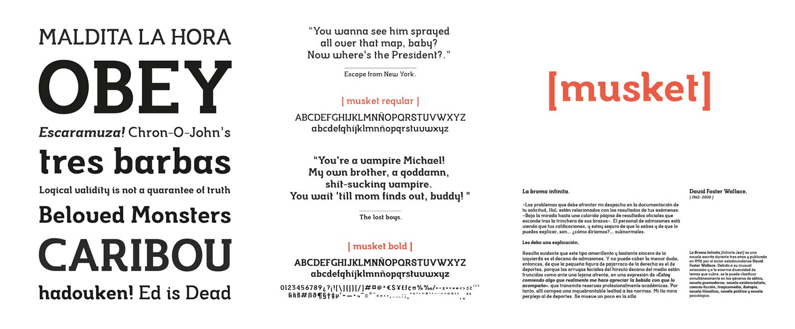
Musket (free)
Chunk ($free — trial plan)
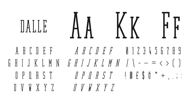
Dalle (free)
Tetre Bold (free)
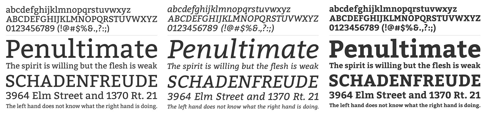
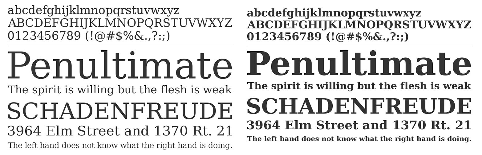
PMN Caecilia (from $26)
Jubilat (from $49.99/year — portfolio plan)
Citizen (free)
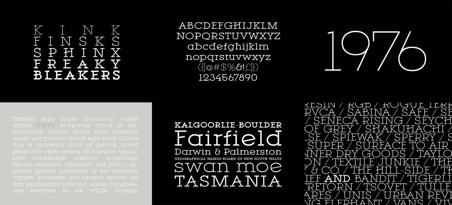
Museo (free)
Glegoo (free)
Bree (free)
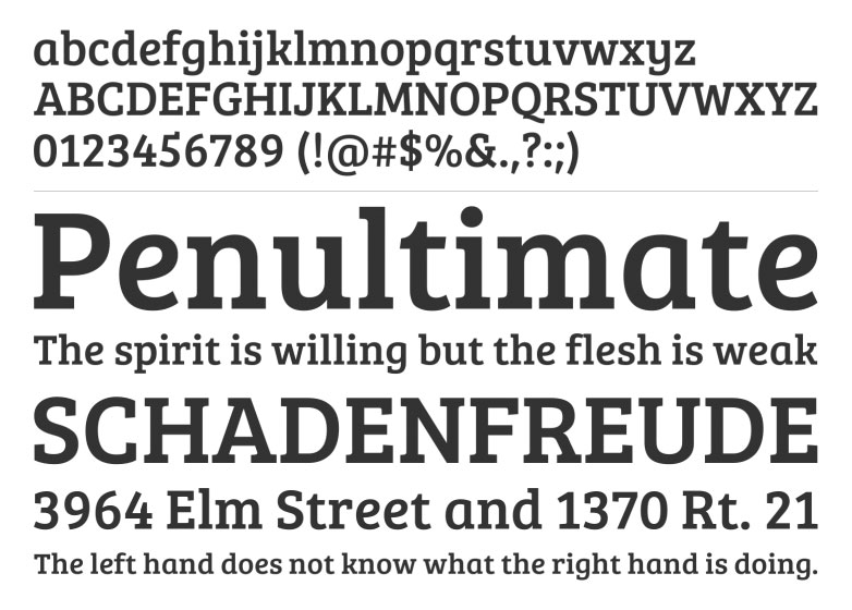
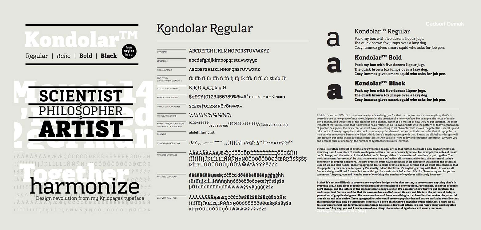
Kondolar ($99)
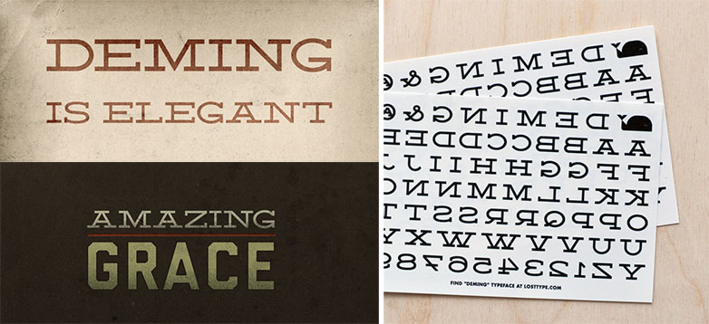
Deming (donation)
Lexia (from $49.99/year — portfolio plan)
Sanchez (free)
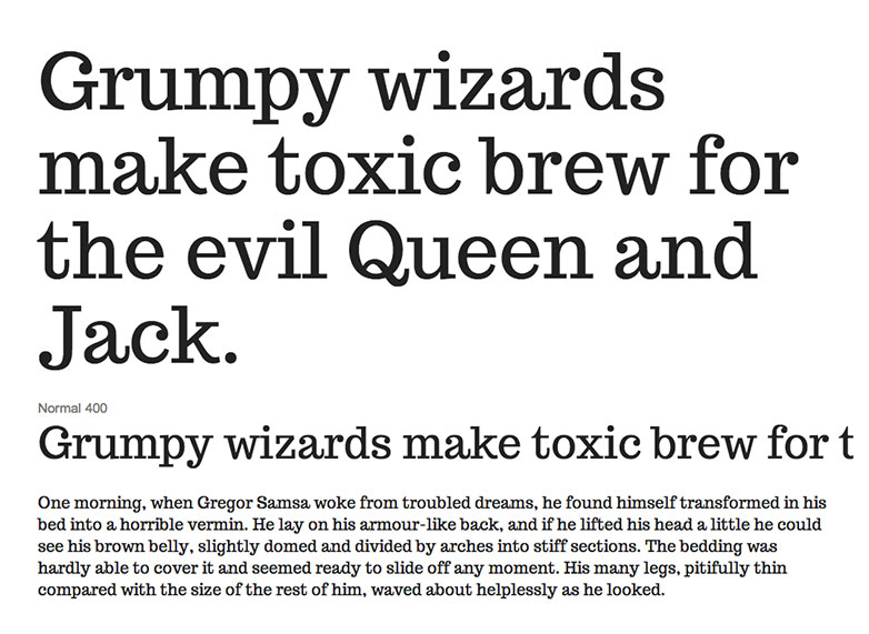
Archer (from $99/year)
Tabac ($399)
St. Marie (free)
Habibi (free)
Kulturista Web (from $49.99/year)
Juan (free)
Memphis Bold ($19.95)
Kreon (free)
Roboto Slab (free)
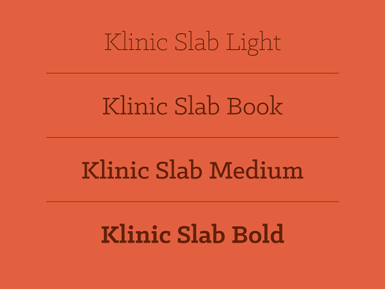
Klinic Slab (from $45)
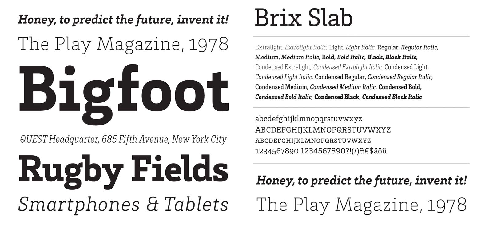
Brix (from $40)
Rokkitt (free)
Sreda (free)
Trocchi (free)
Bitter (free)
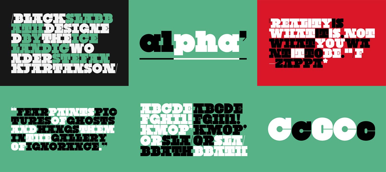
Black Slabbath (from $24.99)
Bitstream Vera Serif (free)
Arbutus (free)
Motown Expanded (from $19.99)
Josefin Slab (free)
Vitesse (from $99/year)
TypoSlabSerif Light (free)
Antic Slab (free)
Quatro Slab (from $24.99/year)
Which of these slab-serifs is your favorite? Have we missed any of your favorites? Let us know in the comments.
Ben Moss
Ben Moss has designed and coded work for award-winning startups, and global names including IBM, UBS, and the FBI. When he’s not in front of a screen he’s probably out trail-running.


Read Next

3 Essential Design Trends, May 2024

How to Write World-Beating Web Content

20 Best New Websites, April 2024

Exciting New Tools for Designers, April 2024

How Web Designers Can Stay Relevant in the Age of AI

14 Top UX Tools for Designers in 2024

What Negative Effects Does a Bad Website Design Have On My Business?

10+ Best Resources & Tools for Web Designers (2024 update)

3 Essential Design Trends, April 2024

How to Plan Your First Successful Website

15 Best New Fonts, March 2024
