Responsive Hero Images

Hero images present unique challenges for responsive designs. During a recent responsive images audit, we found a unique solution which I wanted to share.
What are hero images?
Until a couple years ago, I was unfamiliar with the term hero image. A friend who worked for a large agency used the term, and I had to ask what it meant. I don’t know if it is a common description and I was living under a rock. Or maybe it is agency jargon.
But just in case I’m not the only one who doesn’t know what a hero image is, a hero image is a large promotional image like the one from Target below:

Responsive hero images?
Hero images often present unique problems for responsive designs. Many hero images have text in the image itself. When text is in an image, it often means that the responsive image will fall into the art direction use case instead of the easier to solve resolution switching use case.
We can see an example of why the art direction is important by looking at the CB2 site and one of its hero images.
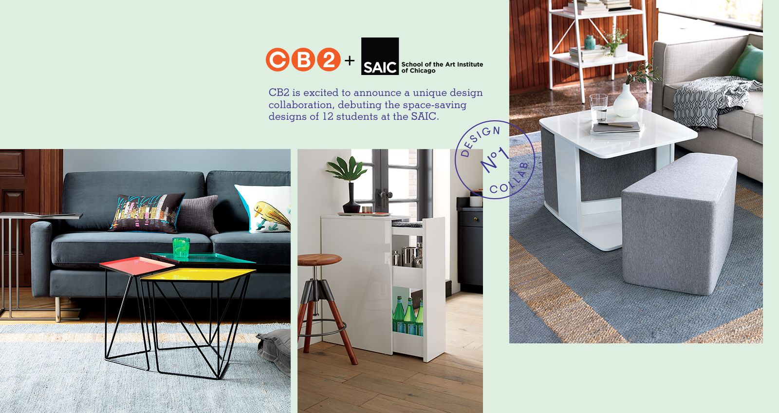
This image contains three photographs, two logos with type in them, and a stamp and text that both use thin strokes. If we simply resized this image to 320 pixels wide, the text would be too small to be readable.

CB2 doesn’t currently have a responsive site, but it does have a mobile web site where we can see how they handle this hero image on small screens.

In order to make the image work on small screens, CB2 does the following:
- Changes from three photographs to two
- Removes text
- Modifies the aspect ratio to make the image taller
- Redesigns the layout of the image
As you can see the changes necessary to make a hero image work on small screens can be substantial.
Requirements for hero images
Our usual process for responsive designs is to understand the goals, needs, analytics, and user feedback for each pattern in the design. We use this information to understand the requirements for the pattern and to prioritize what the small screen version needs to accomplish.
The full requirements for hero images can be summed up as:
In my experience, any attempt to narrow down what can go into the box will meet resistance. The people responsible for marketing understandably don’t want their future options limited.
Ideal world solutions
As we were brainstorming ideas on what to do for this client, we kept finding ourselves referring to what we would do in an ideal world.
In an ideal world, we’d:
Build complex HTML5-based animations like Apple.
Apple has created rich pages that react as you scroll and otherwise interact with them. They make the old days of flash animation look quaint.
They are also one of the wealthiest companies on the planet and only release new products once a year. You may not have similar resources.
Remove text from images, put it in HTML, and use CSS to overlay the image.
This makes a ton of sense. If we separate out the text from hero images, then we can adjust the placement of the text as the viewport changes.
Sites like Crate and Barrel have established a specific text treatment and placement for all promo images.

However, this again is an ideal world situation. All of the photography must have areas that are designed to accommodate the text. You can see how Crate and Barrel must ask all of their photographers to keep this in mind.
That solution may not work depending on the requirements of the brand and how frequently the images are being updated.
Real world conditions
We’re often not working in an ideal world. Take Free People for example:

Free People has a strong artistic vision for their site. The combination of type and imagery matters. And they update the images daily.
If you’re updating hero images on a daily or weekly basis, many of the ideal world solutions are impractical. Not to mention the fact that the people responsible for creating the hero images may be graphic designers, not web designers or developers.
Give them <picture> and let them have their box
After striking out on the idealistic solutions, we started looking at ways to give the designers as much control as they might need.
We thought, “We should use the picture element to give them a box that marketing can use. Then their designers would have complete control to decide how many image sources they need and where the breakpoints should be.”
Doing this would have been easier for us, but it would have been a jerk move.
Imagine what this would have meant for the designers who create these images. Not only does the responsive design mean that they have to create multiple versions of hero images now.
But we’d also be asking them to figure out how many versions of the hero images they need to make and where the image breakpoints should be. And they need to figure this out every day for every image they create.
Like I said: a jerk move. Don’t do this.
Using hero image text to determine breakpoints
After striking out on several different solutions, we realized that the text might be the key. If it weren’t for the text in these hero images, the hero images would fall under the resolution switching instead of art direction use case.
We wondered if there was a way look at how well the text resized and determine the breakpoints based on when the text became illegible.
This was the point at which we discovered that there were in fact a few requirements for the client’s hero images:
- The images must use the brand’s chosen typeface.
- The typeface could not be smaller than 18pt.
All of the images must follow these rules. So we set out to find out how well the typeface resized.
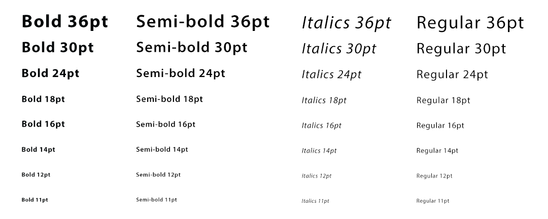
We started by creating a canvas in Photoshop that matched the largest size that the hero images would ever be used at. We filled that canvas with the chosen typeface in various sizes and weights.
Below is an example of what that canvas would have looked like if the typeface was Myriad and brand color was black.
After we saved the image as a PNG, we opened it in Chrome and started resizing it until the text was unreadable.
We determined that the 18pt italics weight became unreadable at around 774 pixels. So we created a new image that started at that size and repeated the experiment.
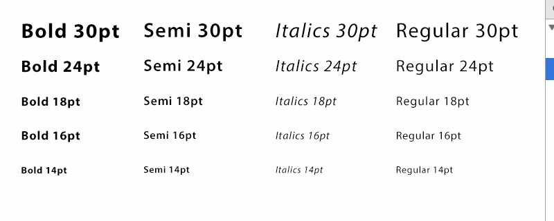
The new image could span from 780 to 540 pixels wide before it became unreadable. So we then made a third image that started at 540 pixels wide. The third image worked at our smallest supported size, 320 pixels, so we stopped there.
Adjusting for ease of implementation
Once we knew where the type was no longer readable, we made some minor adjustments. We changed the image breakpoints from the arbitrary measurements that we had received in our experiment to numbers that were more easily divisible, and where possible, matched our grid.
So instead of using 774 pixels as the point as which we should switch from the 1080 image to a different one, we decided on 780 pixels.
We then took several of the existing hero images and attempted to make smaller versions of them using the new image sizes. We found, similar to the CB2 example above, that we needed to adjust the aspect ratio of the hero images in order to give us more vertical real estate on small screens.
After we had completed all of our tweaks and had new sizes for the responsive versions of the hero image that we thought would work, we used our type image resizing technique to verify that the typeface would hold up for the range of that we were going to recommend.
Type-based guidelines for responsive hero images
When we had completed our research, we had a simple set of guidelines that we could give to the designers responsible for the hero images.
| Image | Breakpoints | |||
|---|---|---|---|---|
| Name | Width | Height | Max Width | Min Width |
| Large | 1080 | 360 | n/a | 781 |
| Medium | 780 | 320 | 780 | 541 |
| Small | 540 | 270 | 540 | n/a |
So long as the designers didn’t use anything smaller than 18pt and continued to only use the typeface that the brand specified, then the three sizes of hero images that we specified would work.
I know it seems suspicious that we ended up with small, medium and large images when so much of our industry is focused on mobile, tablet and desktop.
But we didn’t pick three image sources ahead of time. We let the type tell us how many breakpoints were needed.
In fact, we did a test and found that if the client wanted to use 16pt in their typeface of choice, that it would have required four breakpoints. And if they change fonts, a new experiment would be needed.
Start with an audit and let content be your guide
This system worked for one client on one project. It may not work for your project.
But whatever you do, it is a reminder that finding a solution starts with a responsive images audit. And whenever possible, we should let the content dictate how our responsive design will respond.
Jason Grigsby is one of the co-founders of Cloud Four, Mobile Portland and Responsive Field Day. He is the author of Progressive Web Apps from A Book Apart. Follow him at @grigs.


