Last month WordPress contributors approved accessibility coding standards for the core handbook. All new and updated code will need to conform with WCAG 2.0 level AA guidelines.
With WordPress core moving firmly in the direction of accessibility, its new guidelines set the bar for themes, plugins, and websites built on top of the platform. Text and background contrast, an important factor in readability, is one of the easiest places to get started. WCAG 2.0 color requirements recommend a contrast ratio of 4.5 for small text or 3 for large text, which is 24px or 18px bold.
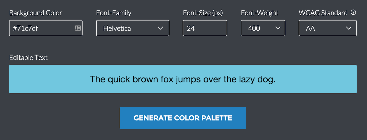
Color Safe is a handy web app that helps designers select color combinations that will meet WCAG 2.0 guidelines for those with different visual capabilities. You enter the background color, font family, text size and weight, and the tool generates a palette of safe options for your text color.
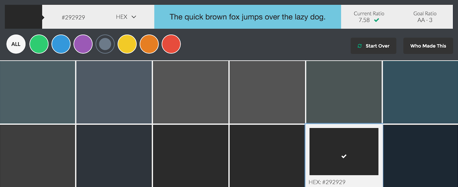
The palette can be sorted by general color groups and selections can be previewed at the top of the screen. By default, the generator uses AA level guidelines. If you’re building for a company or government website that requires AAA specifications, you can select it from the dropdown and all colors generated in the palette will be in compliance.
Color Safe was built by Salesforce UX engineer Donielle Berg and product designer Adrian Rapp to help designers include accessibility as part of the design process. The tool takes the guesswork out of complying with WCAG guidelines and makes it easy to visually explore accessible color combinations.


Another good tool is a11y, a Javascript bookmarklet that you can load on any site to see an analysis about colors, headings, links, etc.
https://github.com/Khan/tota11y