


In the early days of the mobile web, way back in the late late nineties and early noughties, there was only one technique available to publish web pages to mobile devices: bespoke mobile content. There was simply no way that desktop-focused content could be made to work unaltered on the mobile devices of the time, which had barely usable browsers, minuscule memories and minimal processing power.

The grim reality of WAP
One of the earliest initiatives to create a set of standards around the mobile web was Wireless Access Protocol (WAP), a suite of protocols specifically designed with mobile web in mind. WAP incorporated some useful ideas but arguably failed everywhere outside Japan. WAP’s reputation was perhaps irredemably harmed by the vast gulf between the breathless advertising and the grim reality of 4 lines of monochrome text, and sparse content. Witness this BT Cellnet ad from the early noughties, as an example:
https://www.youtube.com/watch?v=sdSSsuSssg0
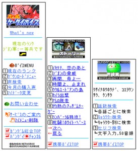
i-mode’s rich & quirky content—note accelerator keys
NTT DoCoMo’s i-mode was arguably much more successful, though limited to Japan. Where WAP’s WML felt finnicky and unfamiliar, i-mode’s markup was based on a useful subset of HTML and thus was familiar to developers. I-mode also made extensive use of emoji to help designers create interesting content without being weighed down by images. Coupled with a progressive business model and capable handsets, i-Mode and its Japanese competitors were extremely successful in Japan throughout the noughties.
Thanks to the entirely different markup formats in use in this era and no expectation of sharing links between mobile and desktop, it felt reasonably natural to use different entry points to websites. In Japan i-Mode websites often used an ‘i.’ prefix; ‘m.’ was more common in the west. The .mobi domain was another scheme designed to label mobile-friendly content.
And thus, thanks to the direction set by handset limitations in the early days of the mobile web, the received wisdom for the first decade or so of the mobile web was that dedicated mobile content on a separate URL was the way to go.
A new hope
This situation really started to change only in about 2006 when Nokia started shipping the S60WebKit browser on its S60-based smartphones. This browser was capable of rendering full websites and included a page overview and zoom features to help users select and view the parts of the page they were interested in. This watershed in mobile web history was bolstered in 2007 with the launch of Apple’s iPhone, which included a mobile version of Safari that offered a similar feature set to Nokia’s, but was made much more useful by Apple’s intuitive pinch to zoom technology.
S60 WebKit browser
In the eyes of many, the mobile web truly became a viable entity at this point—mobile browsers appeared to be capable of handling almost anything; burgeoning 3G networks promised to address bandwidth qualms.
Soon enough, people naturally started to question whether mobile-specific content and URL schemes had any place in this new reality. Why go to the trouble of authoring a mobile-specific content if smartphones can consume desktop content as-is? This sense view resonated with the W3C’s One Web principal, though in fact this principle is stated in a carefully nuanced way that allows for different representations.
And so a movement began that advocated serving the same content to all devices. But once the intoxicating appeal of browsing full websites on mobile devices started to wear off, the problems with this new-found capability started to emerge: the awkwardness of panning and zooming around content on a small screen. Yes, everything was possible, but it was slow and awkward.
The responsive web design age
In 2010 Ethan Marcotte wrote an article for A List Apart in which he outlined a set of approaches to handle this issue. The article proposed three techniques to enable content to display well in any viewport, big or small. This was the silver bullet that enabled content creators to author a single set of content—along with with rules governing its display—to fit reasonably well on most devices with nary a line of server-side code.
The appeal was obvious and within a few years the entire web industry was on board and RWD was the Right Way to author web content. Murmurings of dissent about the mobile context were batted aside in favour of the hard-to-argue-with principle of not limiting options offered to mobile users, and One Web.
It took a while for a more sober view to emerge. The immediate appeal of fitting everything nicely onto the screen gave way to a deeper analysis of what this actually meant in terms of bytes sent over network and the load imposed on the client. Images in particular were troublesome, since many responsive designs simply hid elements at small sizes, but downloaded them anyway. A new standard for responsive images was called for to address this issue and one eventually emerged from the W3C.
Existential crisis for the web
As the responsive design movement was unfolding the web ecosystem was revelling in the capabilities enabled by capable browsers, fast JavaScript engines and HTML5. Ad libraries, rich JavaScript components and embeddable social media widgets offered an intoxicating mix of features that proved hard for site owners to resist. Their single-line copy & paste integration offered effortless features without any apparant downside.
The party couldn’t go on forever. Rich embeddable components turned out to be the web performance equivalent of a Trojan horse—willingly invited in, but silently and relentlessly undermining sites’ performance over time, unnoticed, from the inside. Meanwhile, images grew bigger and heavier, not helped by the introduction of very high resolution mobile displays.

A few bytes needed, a few MB served
Little by little the web became heavily so heavily encumbered that its very existence became threatened by its own bloat and consumers’ resulting preference to view content from their favourite social media app. Google abetted the bad practices—it launched mobile test tools that tested visual fit on screen with no consideration given to bandwidth, CPU or battery.
The inevitable hangover arrived decisively in 2015 / 2016. Faced with a performance crisis, both Facebook and Google felt that something needed to be done to address web performance on mobile devices. Facebook launched its Instant Articles format, Google launched AMP. Both projects use some similar methods to achieve their goals: a tightly controlled subset of HTML to ensure that performance promises can be delivered. Wechat’s WeUI (weui.io) takes a similar approach.
What’s old is new again
And thus here we are, WAP to the future, in a place that looks remarkably like where we started out in the 1990s, with many prominent websites now a separate delivering made-for-mobile experience to mobile devices, be it AMP or Instant Articles. Given that there are already one billion AMP pages it’s probably safe to say that there is more mobile-specific content out there now than at the height of the m-dot era.
Could we have done this without AMP or Instant Articles? Yes, of course. But we wouldn’t have—and despite swathes of evidence pointing to the importance of page speed—we didn’t.
Some will fret about splitting the web and say that we have regressed, but on the other hand we now have some really fast mobile sites that reach more devices and lower-end devices than ever before. Could we have done this without AMP or Instant Articles? Yes, of course. But we wouldn’t have—and despite swathes of evidence pointing to the importance of page speed—we didn’t. Instead we got relentlessly heavier and slower.
Which is better—a web with adaptively-served formats or an abandoned web?
Which is better—a web with adaptively-served formats or an abandoned web? Are AMP et al the “right” way to fix the problem? Probably not, but it’s working and no other solution is getting any traction. It seems that it takes SEO pressure from Google to instigate change.
Meanwhile, the number of Alexa top 100 sites using server-side adaptation has remained essentially unchanged since we last measured it 5 years ago, at 80%. RWD is an indespensible technique, but it is best considered as one of the tools in the toolbox, not the sole one.
It is now increasingly accepted that, extraordinary progress made by mobile devices notwithstanding, they are fundamentally physically different to desktop devices, and operate under different constraints. This is not to say worse, necessarily, but certainly different. To treat them equally is to miss the opportunity to do more.
In theory progressive enhancement techniques offer a get-out—a site that builds in richness from a bare-bones experience that works everywhere to a full-featured experience if the user agent supports it. This is how the web is supposed to work—clients are free to ignore content or directives that they don’t understand.
The reality is more complex—it turns out to be really difficult to build a non-trivial site that works in the worst cases (low end device and/or poorly connected device) but that also enhances up to a full, rich experience that meets consumer expectations. It’s simply easier to deliver different experience to device classes. Progressive enhancement (PE) is useful and is a good thing, but its powers are tricky to harness in reality at a wholesale level. This is a controversial thing to say, but if PE really was useful for wholesale adapation, you would see more of it in use. To take one example, the search page served by Google would seem like an ideal candidate for PE techniques. But does Google use it? No, not really—they serve entirely different markup to each class of device. Why don’t AMP pages and Instant Articles enhance up to their full-featured equivalents? It’s just too hard to make it work.
Post responsive design, a new awareness
Thankfully, the meandering journey hasn’t been without benefits. Some learnings have become clear:
- Don’t limit the choices available to mobile devices. It may make sense to rank different functions on a site differently according to the device in question (as Google does), but it doesn’t make sense to withold functionality from mobile users on the grounds that “mobile users will never do that”. They will, and they do, because in some cases mobile is the only way available.
- Responsiveness is a good thing. The web, as originally envisioned, was inherently responsive but we lost sight of this along the way in our attempts to map the thinking and tooling of print onto the web.
- You can’t assume context from device. We made this point here 9 years ago. That said, this ground truth doesn’t preclude optimisation: some use cases are more likely than others depending on the device you’re holding and the best sites optimise their experience on this basis (again, see Google).
- Device-specific URLs are a bad thing. It makes a lot of sense to optimise content for devices but you should ensure that the resulting page URL doesn’t have device assumptions built into it. Device-specific links reduce the utility of that fundamental web feature—links.
- Smartphones aren’t as fast as you think, ditto mobile networks. In both cases the high performance is possible, but generally not sustainable or reliable. In short, you can’t assume either. Google’s Alex Russell demonstrates this really well in his Chrome Dev Summit 2016 video.
- The W3C guidance on mobile web best practices is now looking more prescient—much of what AMP is advocating was described in its Mobile Web Best Practices 1.0 guidelines, published almost 10 years ago.


Leave a Reply